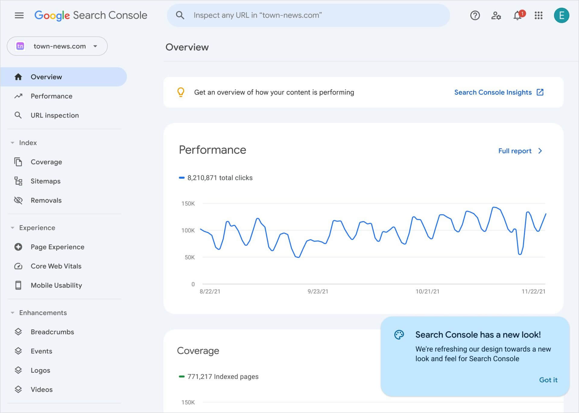
Google has rolled out a new look for Google Search Console aimed at improving accessibility and user experience. If you login to your Google Search Console account at google.com/search-console you will see the new design.
What it looks like. Here is a screenshot of the new design:

Why a new design. Google said this design upgrade is aimed at its efforts to improve accessibility and user experience. Google wrote on Twitter “We’re starting a journey to refresh the look and feel of Search Console. Over the next few months you’ll see small changes in the product with a goal to improve accessibility and user experience in general. We hope you like it!”
Why we care. Search Console is a tool many SEOs use multiple times per day. The new design seems fresh and clean but the functionality, thus far, as far as I can tell, has not changed.
Play around with the new design – we hope you like the updated interface.

